Conditional logic was too confusing
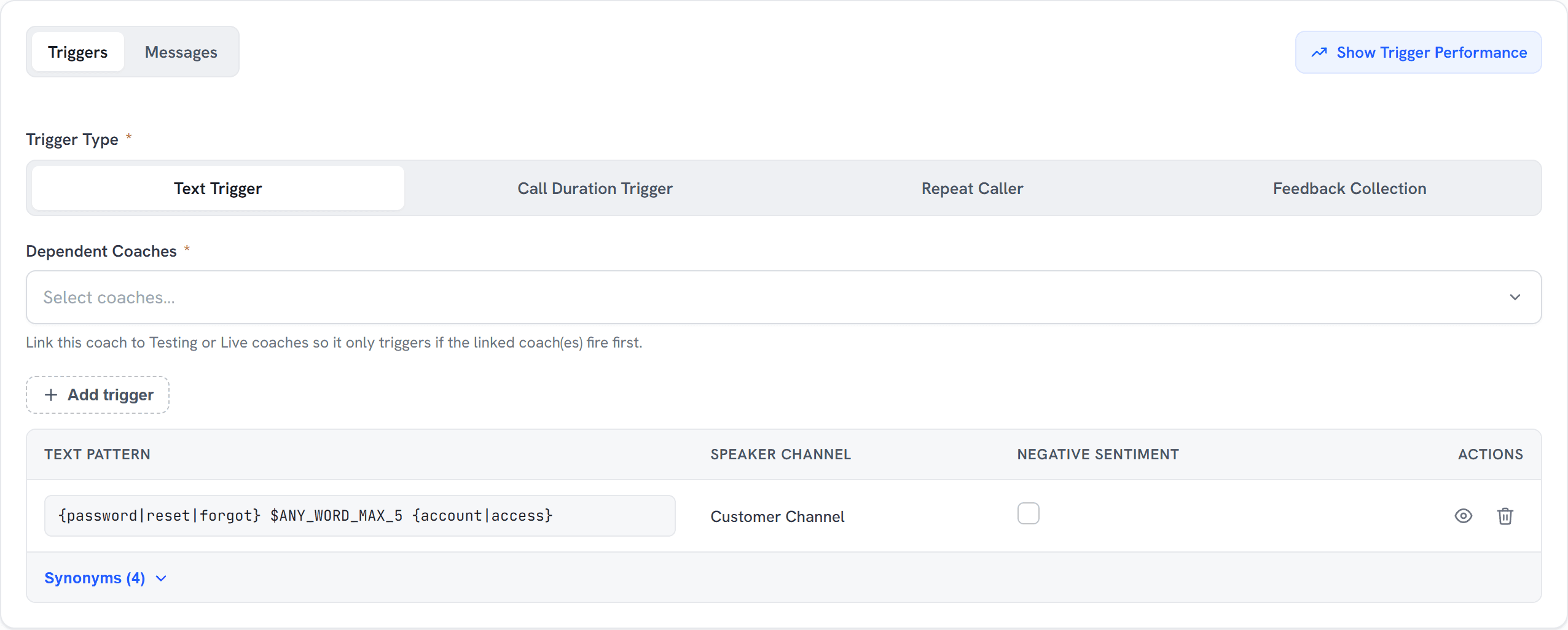
Users struggled with the basic If/Then flow. Building a rule like ‘if a customer says X, and the call runs over Y minutes, then show message Z’ felt like a chore, not setup.
 Alonso Rosado
AI voice experience
Aigent’s AI voice tech was powerful, but setting up the brain behind it was a bottleneck that made teams give up. I rebuilt the Real-Time Coaches flow and the live-call view so supervisors could configure and manage AI guidance on their own.
Aigent
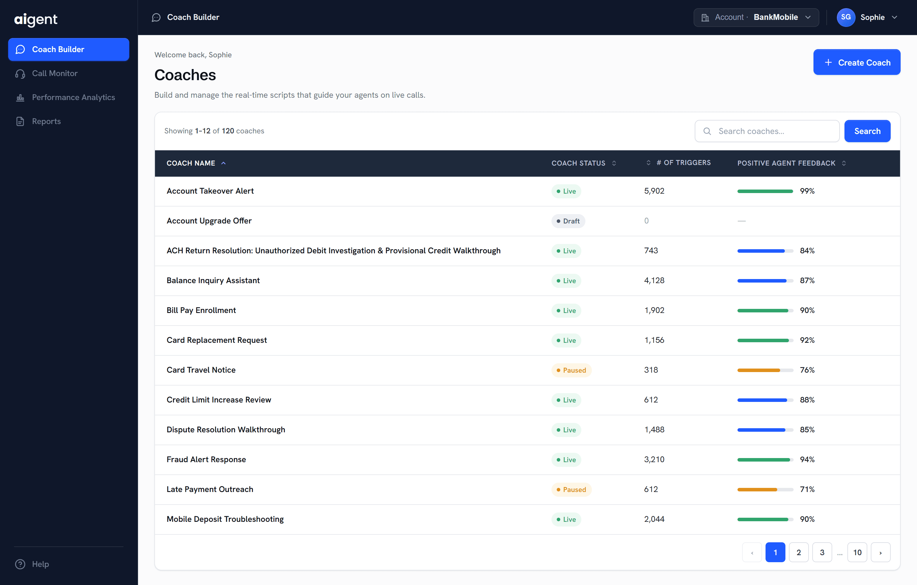
Coach Builder · The real-time coaching workspace
The problem
I led the UX/UI redesign of Aigent’s platform and rebuilt how its real-time AI Coaches get created, the exact step that was killing adoption.
Aigent’s voice technology worked, but setting up the brain behind it, the Real-Time Coaches, was a dense, technical bottleneck. Supervisors couldn’t build guidance quickly, so teams lost interest and gave up.
The business needed supervisors to deploy new coaching on their own, with a clear step-by-step flow and an instant read on whether their bots were actually working.
The redesigned workspace gives supervisors an immediate read on what is live, paused, or still a draft.
What we found
Customer Success feedback and user research pointed at the same culprit: an interface too dense for supervisors to configure.
Users struggled with the basic If/Then flow. Building a rule like ‘if a customer says X, and the call runs over Y minutes, then show message Z’ felt like a chore, not setup.
Supervisors couldn’t tell which coaching scenarios were drafts, which were in testing, and which were live on the floor.
Agent reactions were locked away from the creator workspace, making coaching quality difficult to evaluate and improve.
Testing
Unmoderated tests with real supervisors validated the new flow and changed how I structured the builder. They needed to visualize how the logic connected as they built it.
Supervisors treated the old setup page like one long, overwhelming document and missed the logical steps needed to make the AI work.
I split the long form into a multi-step tabbed layout. Separating Triggers from Messages created a clear, natural sequence.
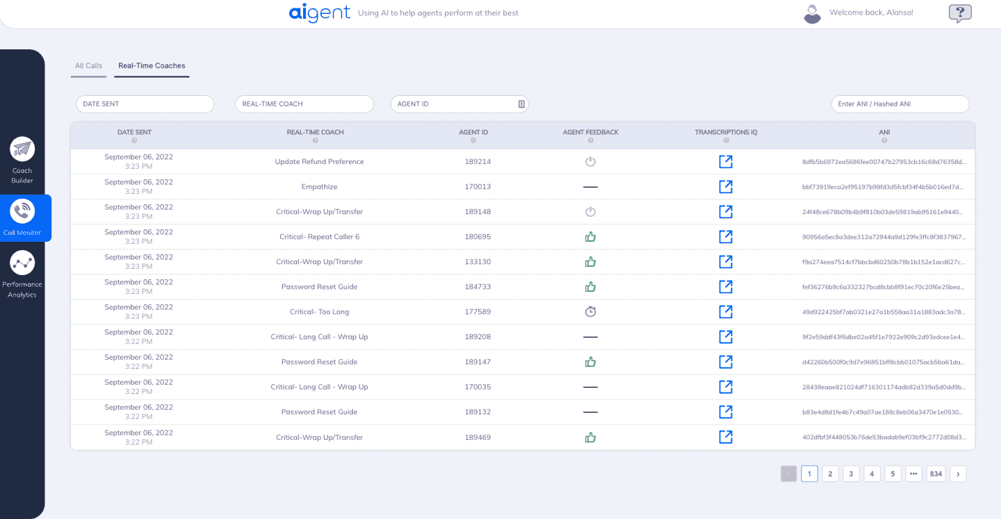
The legacy call monitor was dense and monochromatic, so supervisors couldn’t quickly spot a call going awry.
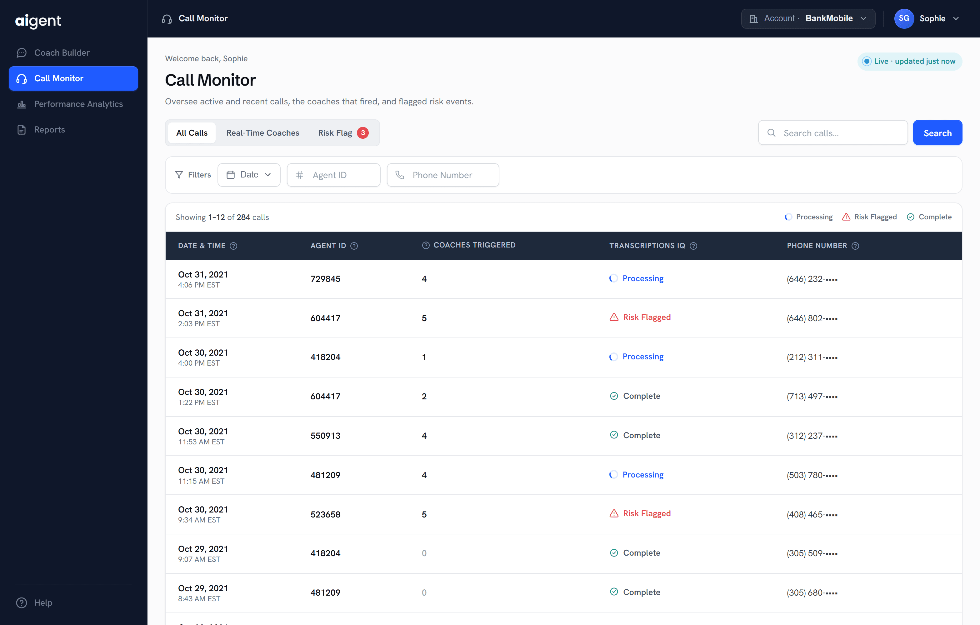
I introduced high-contrast icons for bot sentiment, agent feedback, and live trigger status so an anomaly became obvious in under a second.
A rough draft and a live coaching scenario looked identical, making it easy to confuse what was actually running.
I added a bold, color-coded status bar so supervisors could instantly distinguish draft, testing, and live coaches.

Impact
My contribution was the configuration workflow and live-call interface. Ubiquity’s current Aigent page publishes the ranges below for its wider offering. They provide product context, rather than measured outcomes of my 2022 redesign.
Takeaway
In complex enterprise tools, the hard part is translating dense business logic into steps that make sense to a human. Building the feature and component library together forced every component to earn its place and gave the team a stronger foundation to scale on.