Improved content discovery and usability
The existing social feed was cluttered and difficult to navigate, making it hard for users to discover relevant learning content and engage with updates.
Product Designer (Mobile)
2024
~8–10 weeks
Product Designer
Product Manager
Engineers
User Researcher
Design Systems
Mobile UX redesign
Interaction patterns
High-fidelity UI
Developer handoff


Users struggled to scan and engage with content due to a cluttered and unstructured feed.
Through customer interviews and internal feedback, we identified that users felt overwhelmed by the amount of content in the feed. Important updates, learning content, and social interactions were all competing for attention without clear hierarchy.
This lack of structure made it difficult for users to quickly identify relevant content, reducing engagement with the platform.
User interview | Heuristic analysis | Content audit
Introduce hierarchy and structure to help users quickly scan and prioritize content.
I explored ways to organize content by importance and type, ensuring that learning-related updates and key actions stood out more clearly than passive content.
This led to restructuring the feed into clearer content groupings with improved spacing, typography, and visual hierarchy.

Early explorations focused on improving scanability and grouping content
Wireframes | Layout explorations | Hierarchy definition
Simplify interactions to make engagement feel intuitive and lightweight on mobile.
One of the challenges was balancing content visibility with interaction density. Too many actions created clutter, while too few reduced engagement opportunities.
We tested different interaction patterns and simplified engagement options to reduce friction while maintaining functionality.

Simplified interaction model reduced cognitive load while preserving functionality
Interaction design iterations | Usability feedback | Refinement
Deliver a clean, intuitive feed experience optimized for mobile engagement.
The final design introduced clear hierarchy, improved spacing, and simplified interactions, allowing users to scan content quickly and engage more naturally.
The redesigned feed aligned learning content with social interaction, making the experience feel more cohesive.
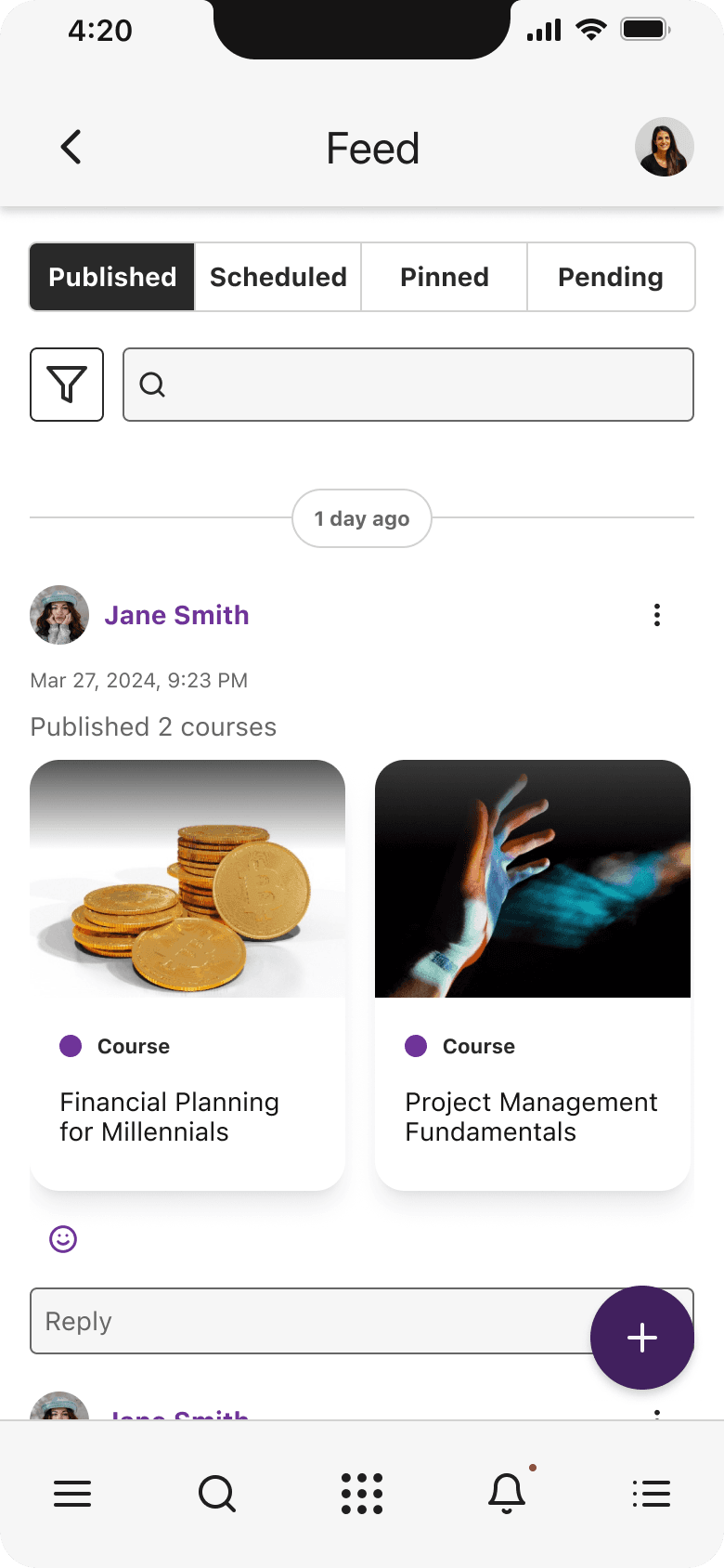
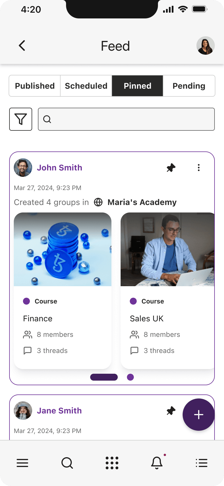
Final mobile feed experience with improved hierarchy and engagement
Interaction design iterations | Usability feedback | Refinement
Conclusion
Current Project Status
Shipped as part of the updated Schoox mobile experience
Next Steps
Continue optimizing engagement patterns
Explore personalization of feed content
Measure long-term engagement trends
Lessons Learned
Designing for mobile requires prioritizing clarity and reducing cognitive load. Small changes in hierarchy and interaction design can significantly impact usability.
What I'd Do Differently
I would involve engineering earlier to explore performance implications of dynamic feed content and personalization opportunities.
Improved content hierarchy supports faster scanning
UI Refresh
As I advanced in my design career, I realized my older designs didn’t reflect my current skills in visual hierarchy, typography, color, and spacing. To showcase my growth, I refined some key screens by:
Enhancing Visual Aesthetics - Improved typography, spacing, and color harmony.
Strengthening Usability - Clearer navigation, better CTAs, and improved readability.
Applying Design Best Practices - More consistent grids, refined corner radiuses, and a polished UI system.
These updates demonstrate how my design knowledge and Figma expertise have evolved, leading to cleaner, more effective interfaces.
PORTFOLIO

AI Voice Experience Redesign
AI Voice Experience Redesign
AI Voice Experience Redesign
2022
~6 months
AIGENT

Award Badges
Award Badges
Award Badges
2024
~6-8 weeks
SCHOOX