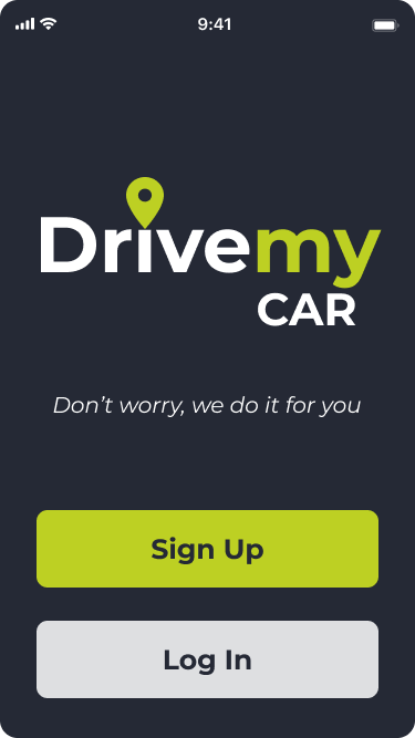
DriveMy
Designed a chauffeur service app enabling users to schedule and request rides seamlessly, with added features for a premium experience.
UX/UI Design | Mobile
Project Overview
Summary
Worked with a real client to design an app or website they needed help creating. My client wanted me to design a low fidelity prototype of an app for his company, DriveMy. It would be a chauffeur service app.
Role
UX Research | UX Design | UI Design
As a one man team and UX/UI designer I had to do all the steps in the design sprint. I had to conduct user research, competitor analysis, create sketches, storyboards, journey maps, and design the low fidelity prototype.
Problem
My project helps solve the problem of drinking and driving, and of not having a chauffeur, because it gives you the possibility to hire someone to drive you around in your car.
Solution
I solved the problems by designing a low fidelity prototype that prevented the worries a potential user would have using a chauffeur service. Specifically, the ability to request a pick up, schedule a pick up, and see a driver's information.
Audience
Key Psychographics
Values
Expect a high quality service with short waiting times
Want
Fast & reliable transport
Social class
Middle class, upper class
Age
Of legal age to drink
Geographic
Density
Urban/rural
Other
Have a license
Have a car
Date
August 2021
Process
Discovery & Research
User Personas
Dennis Segura
30 years old | Customer Service Director
Motivations
Worried that chauffeur is not responsible
Worried that chauffeur will steal his car
Worried that that chauffeur won't listen to how he wants to be driven
Worried that chauffeur is overall not a good/experienced driver
Goals
See reviews people have given the driver
See the drivers biography
See the drivers rating
See how many people has the chauffeur driven
Frustrations
Doesn't know of any chauffeur apps
The chauffeurs he has used before come from a company he has to call, but he knows nothing about the driver being sent
Information Architecture
User Flows
Wireframe Sketches
Digital Wireframes
Brand Development
Color Palette
Accent
Background
Typography
Montserrat - Bold - 30px
Montserrat - Bold - 26px
Montserrat - Regular - 15px
Prototype
Usability Testing
Iterations
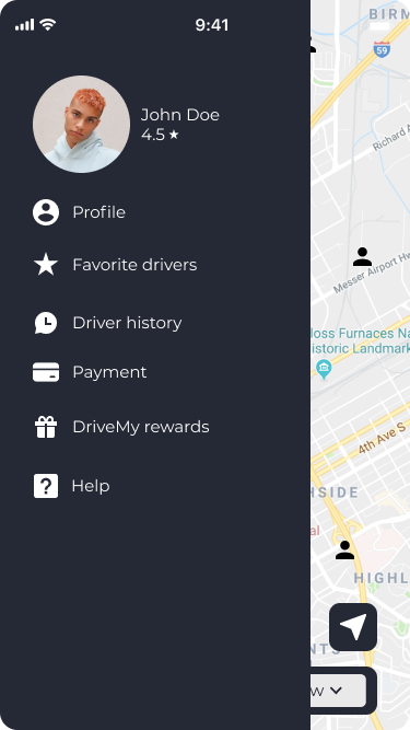
Menu
Before
As I advanced in my design career, I realized my older designs didn’t reflect my current skills in visual hierarchy, typography, color, and spacing. To showcase my growth, I refined some key screens by:
✅ Enhancing Visual Aesthetics – Improved typography, spacing, and color harmony.
✅ Strengthening Usability – Clearer navigation, better CTAs, and improved readability.
✅ Applying Design Best Practices – More consistent grids, refined corner radiuses, and a polished UI system.
These updates demonstrate how my design knowledge and Figma expertise have evolved, leading to cleaner, more effective interfaces.
Before
After
Revised Prototype
UI Refresh
After
Final Thoughts
Successes
What makes this product great is that it was feedback-driven. I tested it multiple times with users, I did interviews, usability tests, surveys, and asked for general feedback on it. It has been built to suit the needs of both the users and my client. My product solution has been based on data not theory and assumptions.
Learning Opportunities
I learned how to integrate my clients feedback into the app’s iterations to be able to achieve his vision while maintaining proper design standards and accessibility.


