Live Voice AI Experience Redesign
Built a design system and redesigned the UI for a startup, ensuring consistency and scalability.
UI Design | Web
Project Overview
Context
June 2022. Startup wanted to modernize and improve the look and feel of their dashboard/product.
Problem
Existing UI was not in a place to meet the product roadmap and scaling goals.
Solution
Redo all of Startups’ UI while simultaneously building out a Design System for scalability.
Role & Team
VP of Product
Product Owner
UI Designer (me)
Data Scientist
Date
October 2022
Process
1) Discuss
Product Owner
Developers
Stakeholders
VP of Product
2) Conceptualize
Sketches
Mockups
Meet with Product Owner
3) Design
Prototypes
Present to Product Team, Implementation Team, and Stakeholders
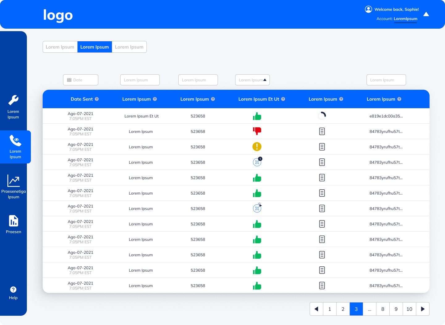
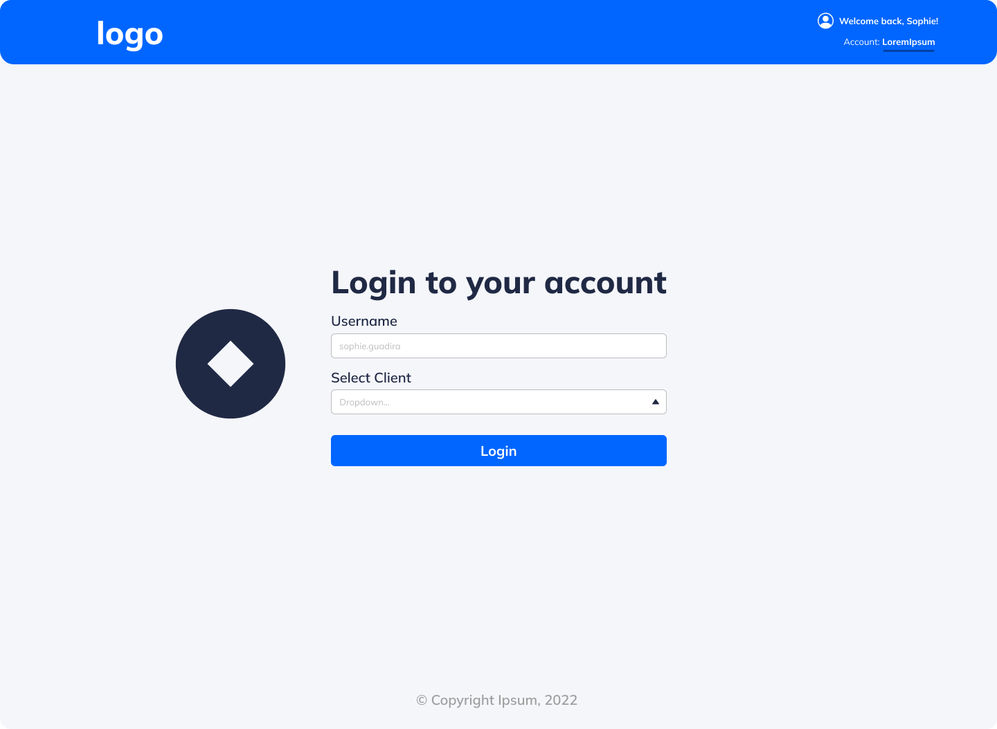
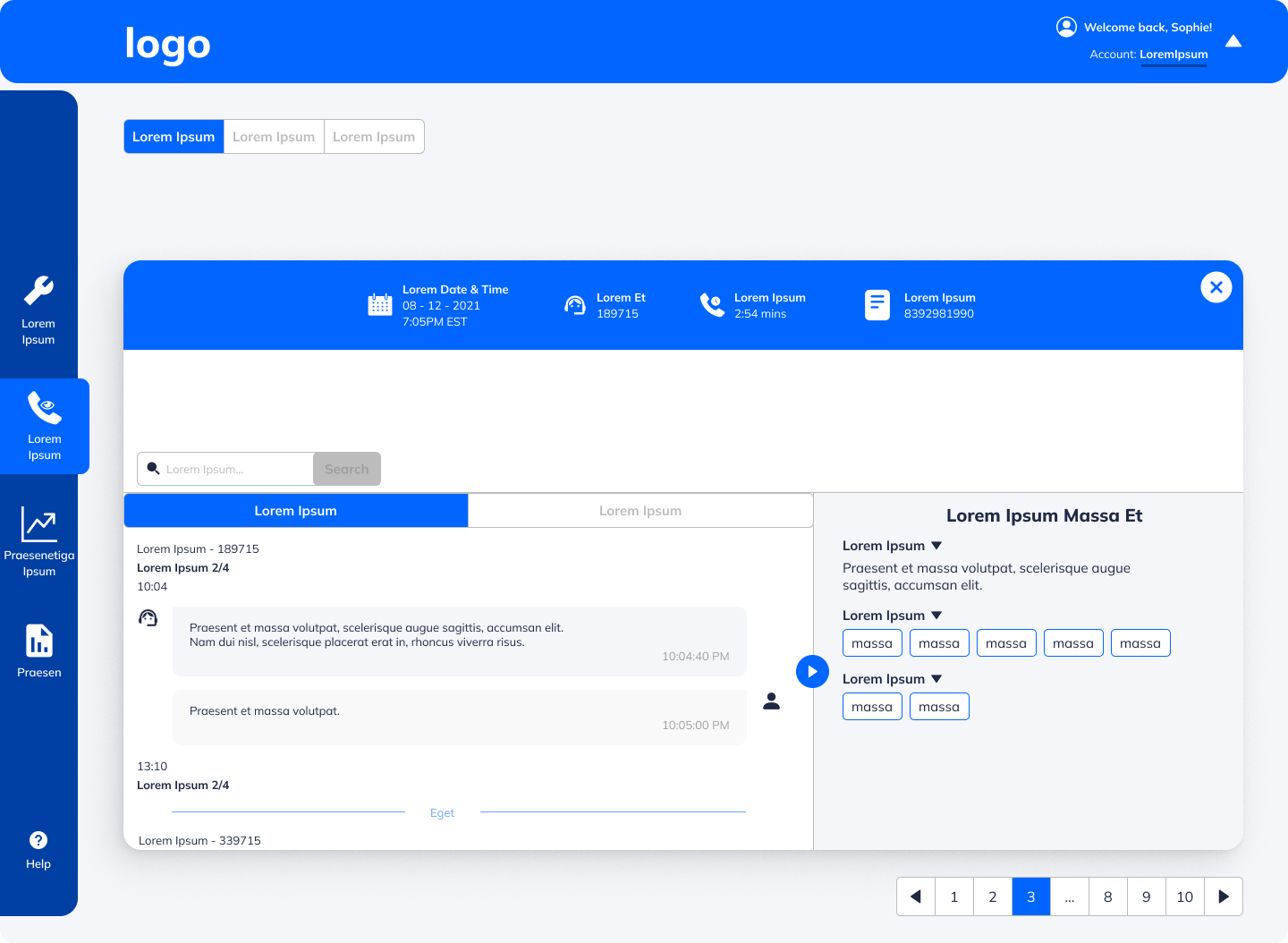
Screens
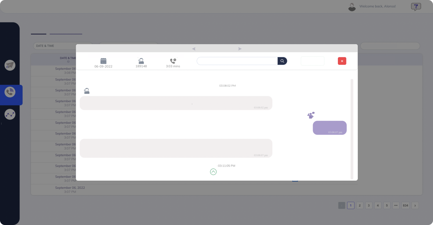
Some elements have been hidden or changed for confidentiality purposes
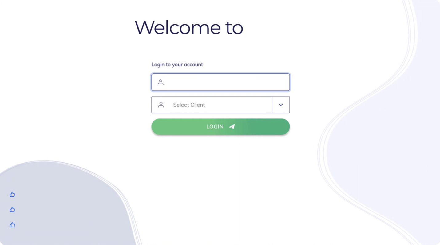
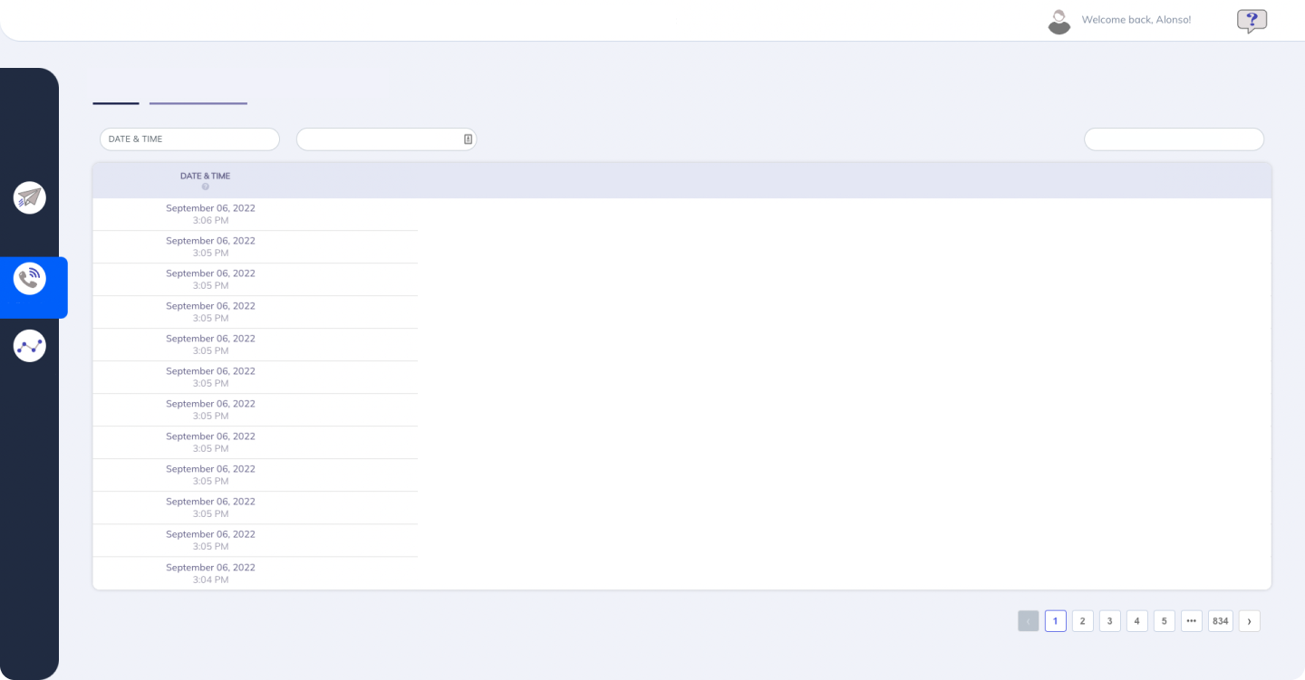
Original
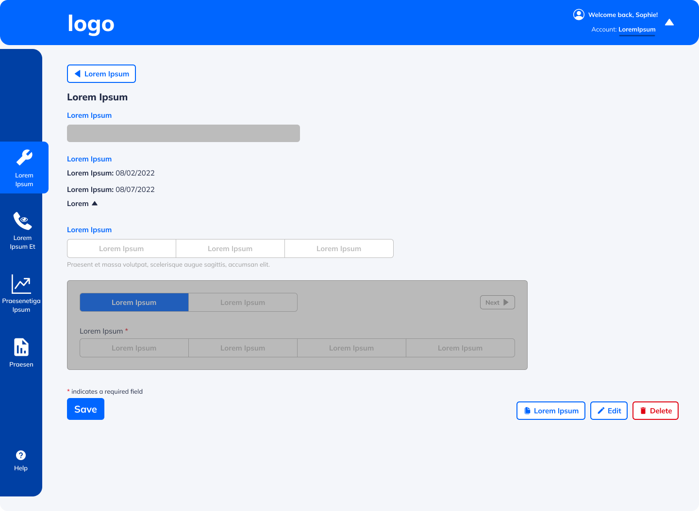
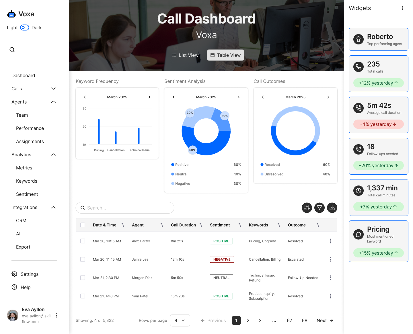
UI Refresh
Before
Redesign
As I advanced in my design career, I realized my older designs didn’t reflect my current skills in visual hierarchy, typography, color, and spacing. To showcase my growth, I refined some key screens by:
✅ Enhancing Visual Aesthetics – Improved typography, spacing, and color harmony.
✅ Strengthening Usability – Clearer navigation, better CTAs, and improved readability.
✅ Applying Design Best Practices – More consistent grids, refined corner radiuses, and a polished UI system.
These updates demonstrate how my design knowledge and Figma expertise have evolved, leading to cleaner, more effective interfaces.
After
Design System
Structure
1) Atoms
Colors
Typography
Grids
and more…
2) Molecules
Breadcrumbs
Checkboxes
Dropdowns
and more…
3) Organisms
Headers
Nav Bars
Dashboards
and more…
Execution
Some of the building blocks of the Design System I created for the startup’s application
Grids
Desktop
Range: 1280px - 1728px
Columns: 12
Margins: 120px
Gutter: 20px
Tablet
Range: 744px - 1024px
Columns: 6
Margins: 60px
Gutter: 20px
Mobile
Range: 320px - 428px
Columns: 4
Margins: 30px
Gutter: 20px
Typography
Aa
Web Browser
Mulish
Regular - Bold - Underlined
Paragraph 01
Paragraph 02
Semi Bold - Bold - Extra Bold
Heading 01
Heading 02
Heading 03
Heading 04
Heading 05
Iconography
Solid/Filled Icons
Colors
Neutral
Primary
Secondary
Tertiary
Success
Error
Warning
Shades
Buttons
Small - Medium - Large
Primary & Secondary
Default
Hover
Pressed
Disabled
Destructive
Destructive Hover
Destructive Pressed
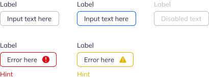
Input Fields
Small - Medium
Default
Focus
Error
Warning
Disabled
Final Thoughts
Successes
The product team and I were able to deliver solutions that the clients were happy with, looking forward to their release, and once some of these features were released or reworked they had a much better experience going through the platform.
Learning Opportunities
I would have loved to bring in the engineers halfway through my design process in addition to the beginning and end. This would have helped avoid any issues where developing the design might be too complicated and there could be a simpler solution that still solves the problem.
Also, it would have been great to implement development handoff tools sooner (like Zeplin) to facilitate and make communication clearer. This would help clearly show what designs are final and what the exact user flow is.

